👩🏻💻
Summary
We conducted a comprehensive usability assessment of GovInfo.gov, a platform providing public access to government publications. Collaboratively researched and redesigned key features to ensure they meet the needs of diverse users. Our findings were recognized and we were invited to present at the 2023 Spring Depository Library Council Meeting.
OVERVIEW
Given the site’s specialized nature, complexity and diverse user base, how can we ensure it delivers a user-friendly experience for everyone?
GovInfo.gov is a crucial platform providing free public access to a wide range of federal government publications, including Congressional Bills, Records, and CFR Indexes. Its users include government employees, librarians, researchers, and anyone needing access to federal publications.
RESEARCH
We initiated the process by preliminary research and proceeded with a usability testing to uncover actionable insights.
📍
Map
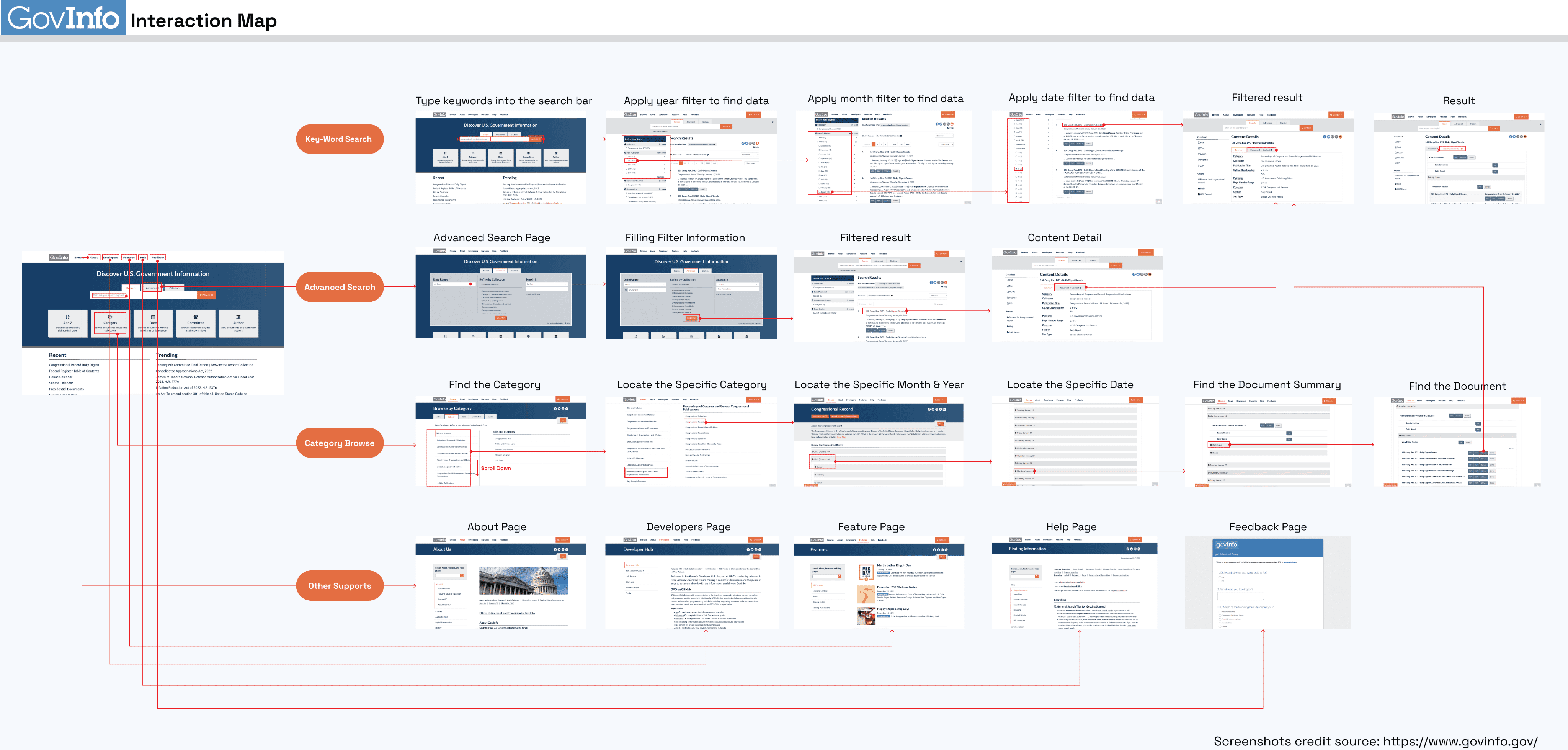
1 interaction map
To gain a thorough understanding of the website
🗳️
Survey
123 responses
To gather quant. data on user profile, behavior, and preferences
💬
Interview
5 user interviews
To gather quali. data offering insights into needs, and challenges
🗂️
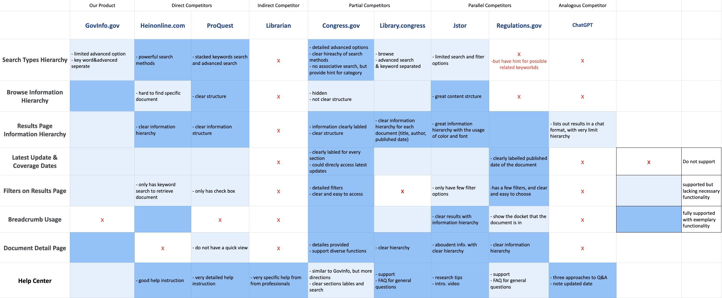
Comparative Analysis
To understand key features and how competitors compare
Interactive Map
Understanding the Site
As the very first step, we created the map to identify key user pathways, understand the website’s structure, and define the scope for targeted research within the given time frame. This effort enabled us to focus on major user flows for keyword search, advanced search, and category browsing.
2. 3. Survey & Interview
Discovering User Insights
Next, a survey was distributed to gather quantitative data, yielding 123 valid responses. Over 50% of respondents were over 30 years old, and more than 90% held a master’s degree. Analysis revealed that over 70% of users searched GovInfo.gov weekly, with Congress.gov and HeinOnline as the most frequently used alternatives.
Meanwhile, we conducted user interviews with five participants, including one stakeholder and four target users. The discussions explored their experiences with scholarly articles and professional documents, their use of GovInfo.gov, and interactions with other databases or websites.
Our findings, outlined below, led us to focus our research on information hierarchy and site navigation.
🚥 User needs
Effective filters to refine search results
Simple and intuitive search methods
Quick and easy file sharing
Access to high-quality information resources
🚧 Pain Points
Difficulty locating share buttons
Lack of clear instructions on how to search
Challenges in accurately locating files
Difficulty determining their current location within the website
In addition, two user personas were developed.

4. Comparative Analysis
Drawing Insights from Competitors
We collected several competitors through surveys and interviews. To understand how GovInfo.gov compares, we analyzed seven direct and indirect competitors and created a scaled matrix based on eight key features.
Usability Testing
Evaluating User Interactions Through Testing
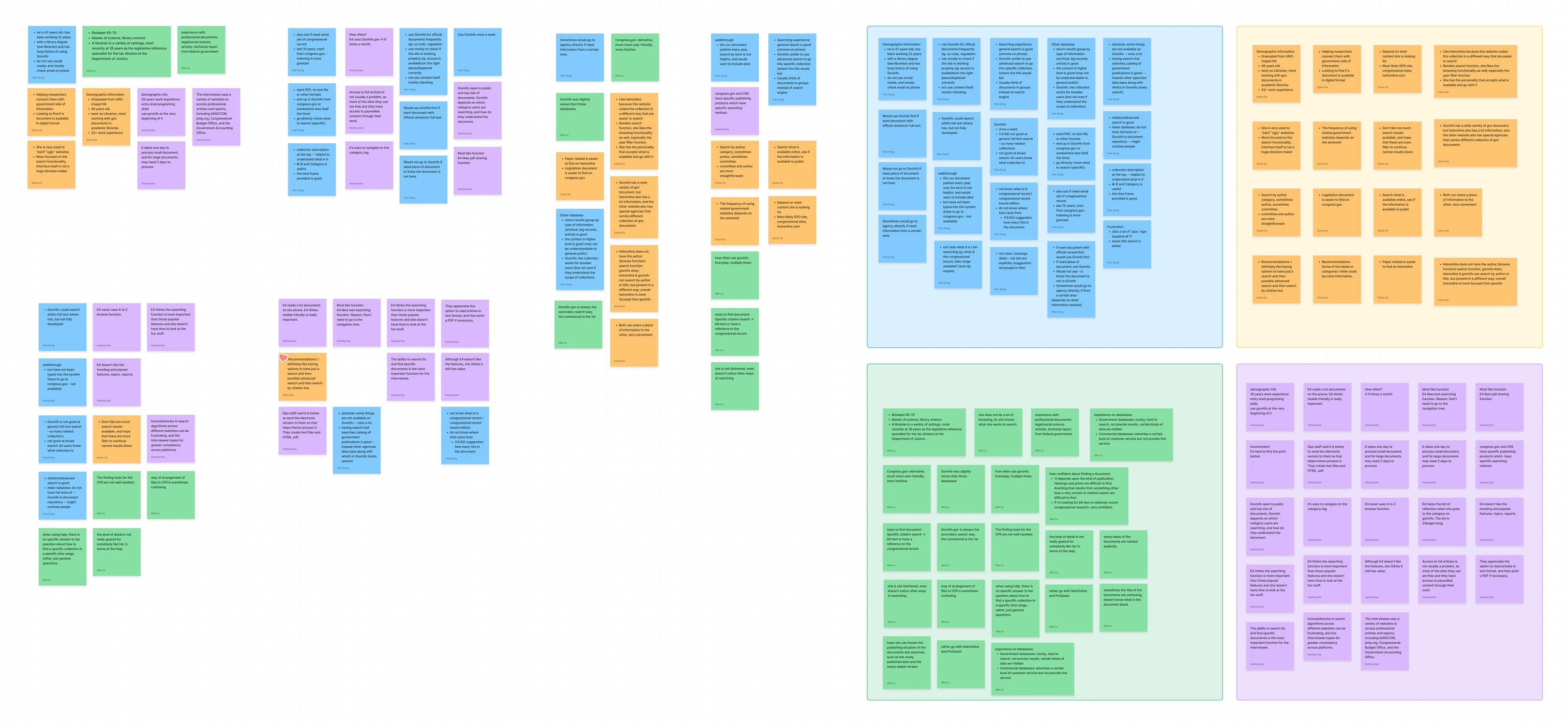
We recruited target users to conduct seven usability tests, gaining insights by observing how they interacted with product features and identifying areas for improvement. Subsequently, we organized the findings using an affinity diagram, grouping and analyzing common themes.
This systematic approach ensured that the product features aligned with user needs, moving beyond assumptions.
Key Findings That Shaped the Redesign
Optimizing Information Hierarchy for Clear Navigation
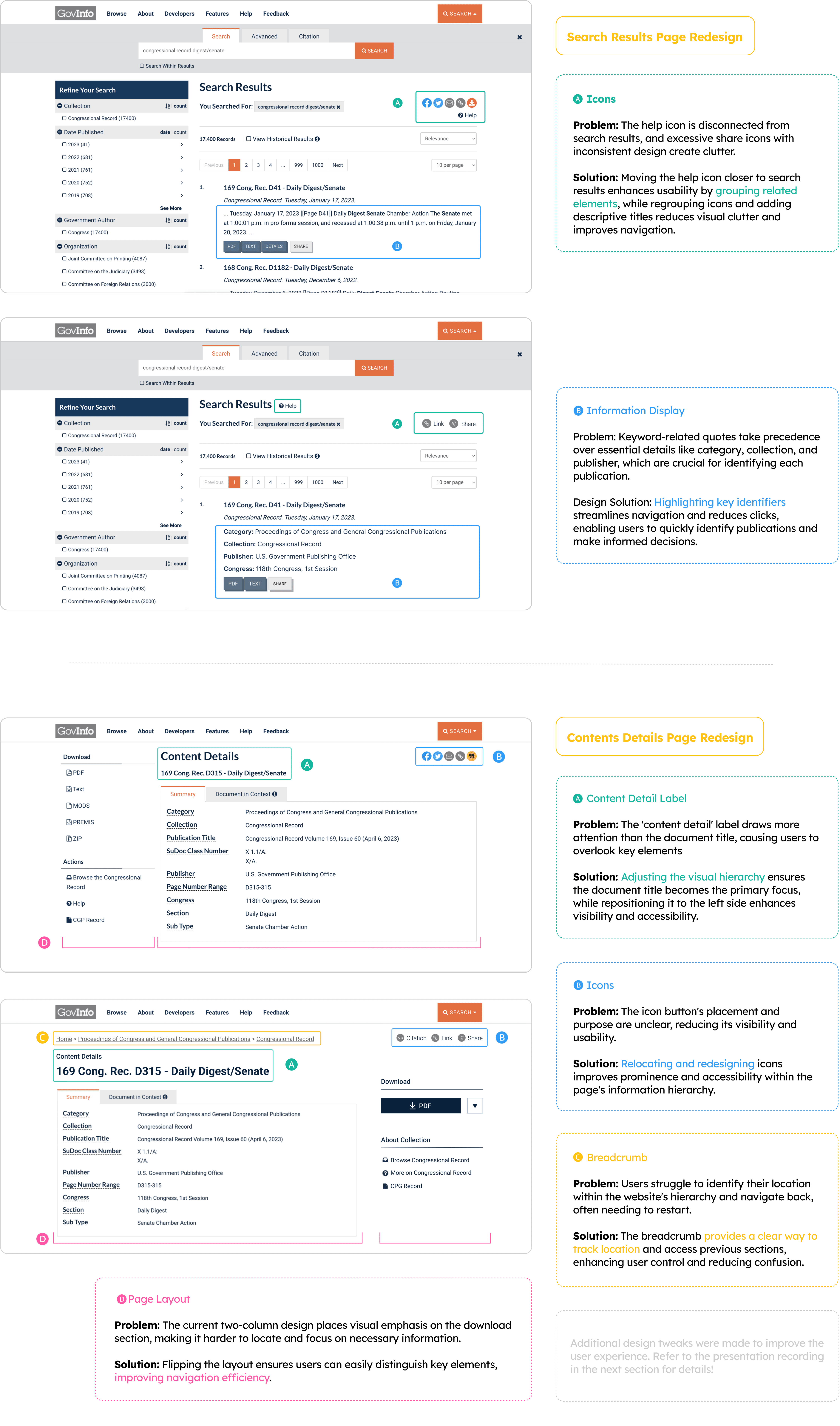
😲 Issue: Scattered attention and slower navigation arise from an ineffective hierarchy and poor icon placement within the search and browsing flow.
🚩Design Solution: Redesigning the layout to align with user habits ensures quicker, more intuitive access to key actions like document downloads.
Better Wayfinding and Contextual Navigation
😲 Issue: Difficulty navigating the website hierarchy arises from unclear organization and insufficient cues, hindering efficient backtracking.
👩🏼: "I don’t know where I am. I can only return to the home page and start over."
🚩Design Solution: Introducing clear location indicators, enhances user control, reduces frustration, and improves overall navigation efficiency.
Let's check out the final design ↓
DESIGN
Building on user research insights, we redesigned the interface and enhanced functionality to better meet user needs.
CONFERENCE HIGHLIGHTS AND NEXT STEPS
We were honored to present our findings at the 2023 Spring Depository Library Council Meeting.
It was a valuable opportunity to share user experience insights and design improvements while connecting with fellow professionals.
Watch the presentation recording here 👋
Wondering About What's Next?
We would love to conduct a second round of usability testing to validate the improvements made, gather additional user insights, and identify any remaining challenges. This will help ensure the design fully meets user needs and enhances the overall experience.
Thanks for visiting.
I’m actively seeking full-time opportunities in UX and product design
If you like my work, let's connect!
©️ 2024-2025 | Made by Haily Ge, fueled by coffee | All rights reserved 🧡
Resume ➝
